
Vertus Insurance Partners
Visual Language & Communications
My Role
Senior Graphic Designer
Deliverables
Visual Direction • Corporate Communications • Marketing Communications • Environmental Concepts

Working within an established identity, I developed a visual language for Vertus Insurance Partners and applied it across corporate stationery, marketing communications, promotional concepts, and environmental applications.
Working Within an Established Identity
Vertus Insurance Partners had an established identity and logo that the client wanted to retain. The challenge was to build a cohesive visual language around that foundation and translate it across corporate and marketing communications.
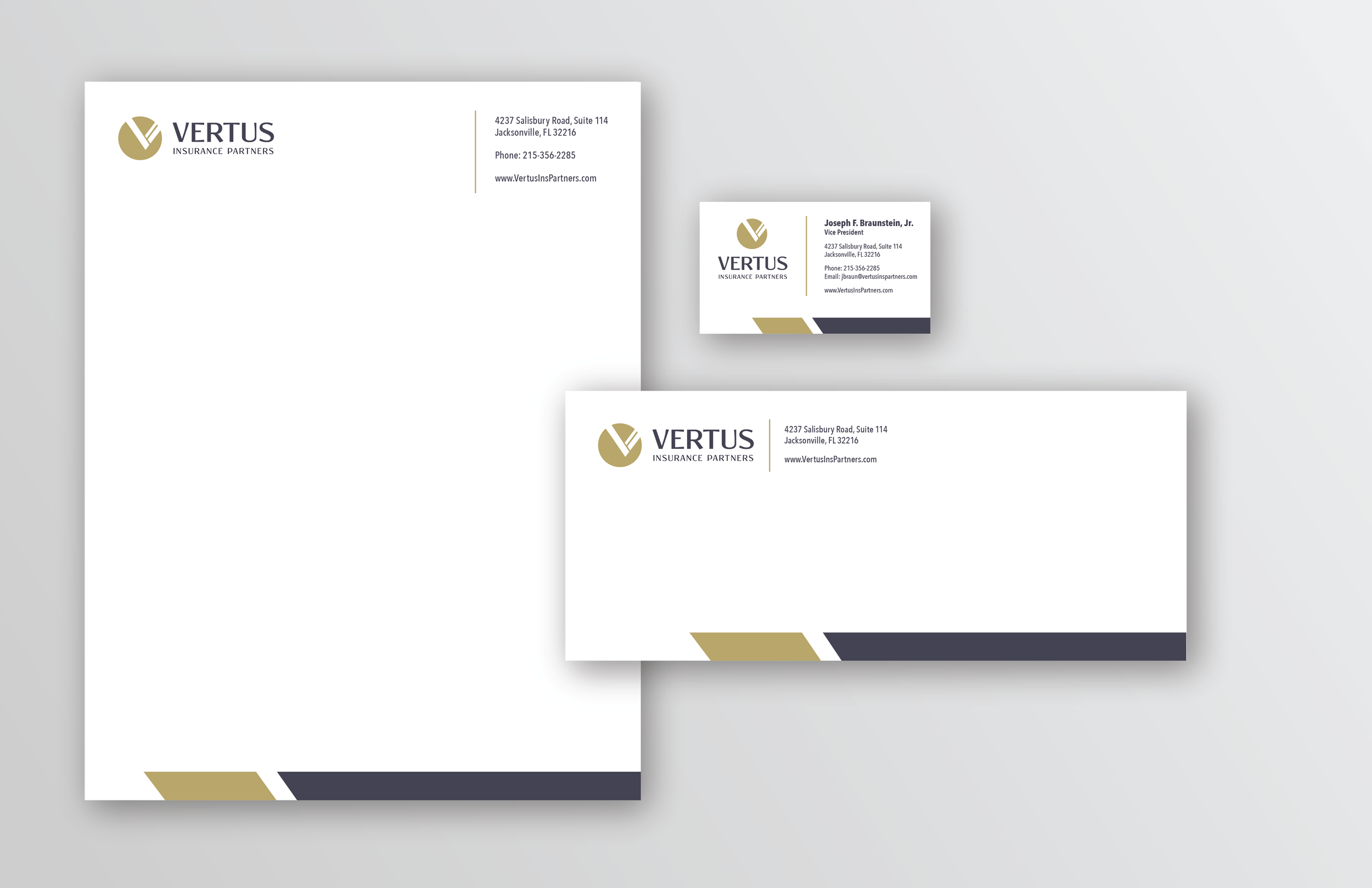
Translating the existing Vertus identity into a cohesive stationery system through typography, color, composition, and hierarchy.
Visual Direction
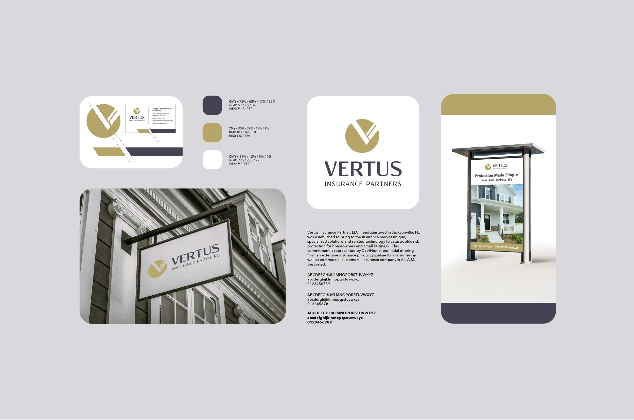
Working within the established Vertus identity, the visual direction focused on creating consistency through typography, color, composition, and supporting graphic elements.
Brochure
The visual language extended into marketing communications, merging the established Vertus identity with clear information structure and a more editorial tone.
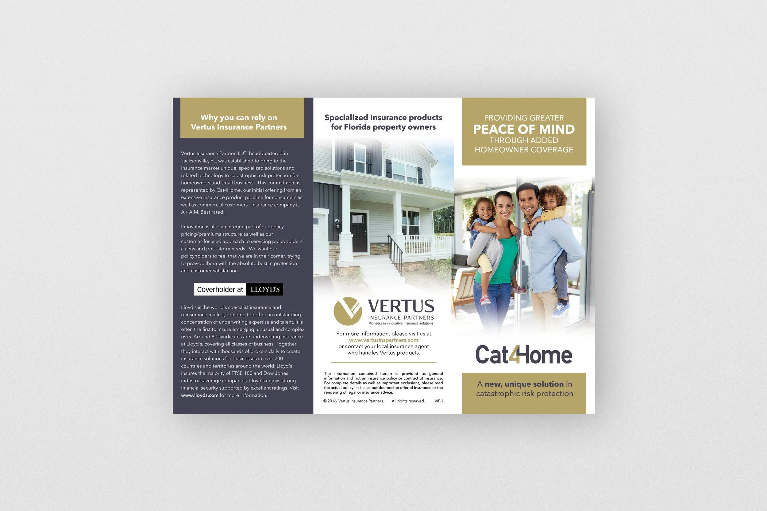
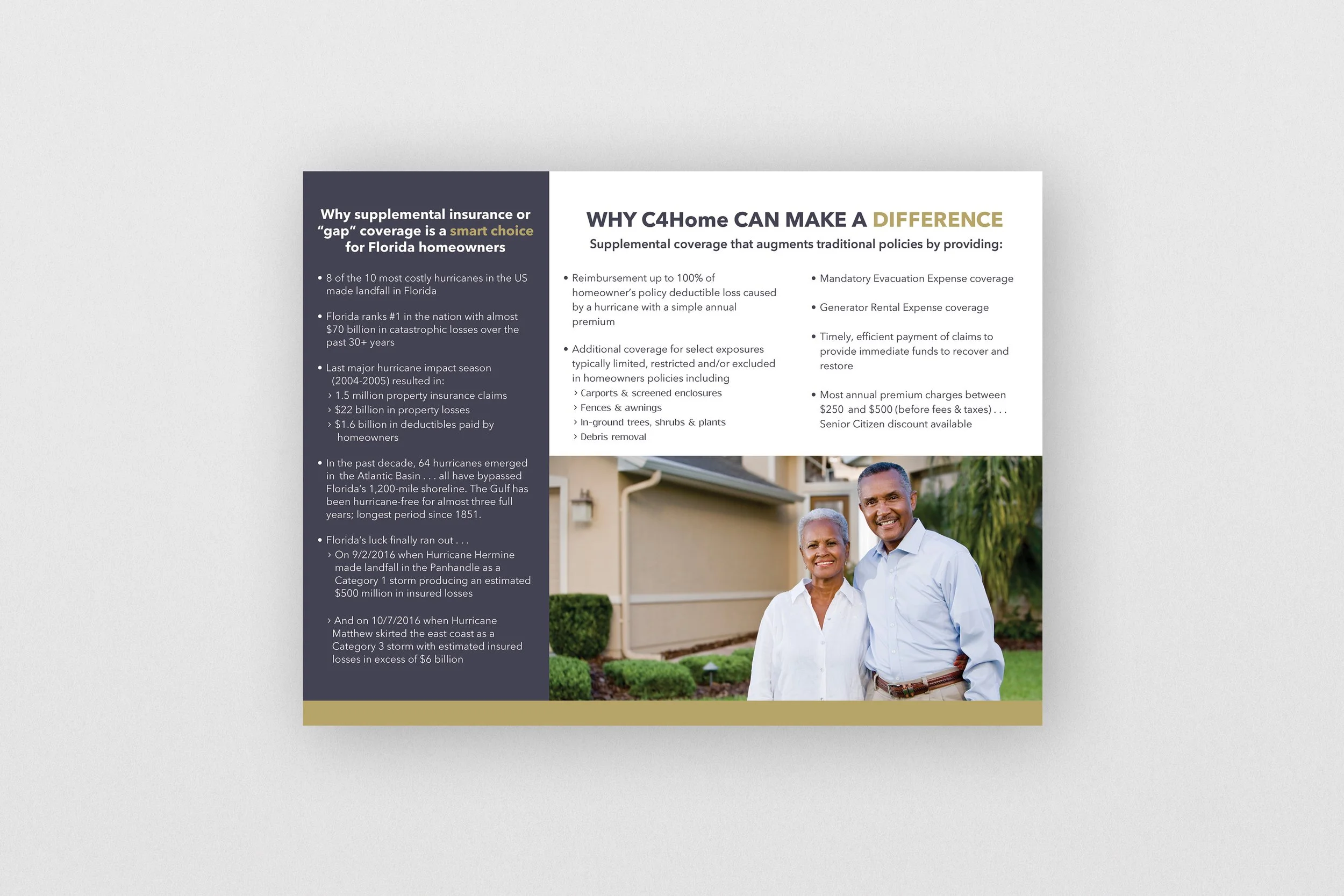
Brochure design developed within the established Vertus identity.
Posters
The same visual language was explored across promotional formats, using scale, typography, and graphic composition to create a more expressive application of the established identity.
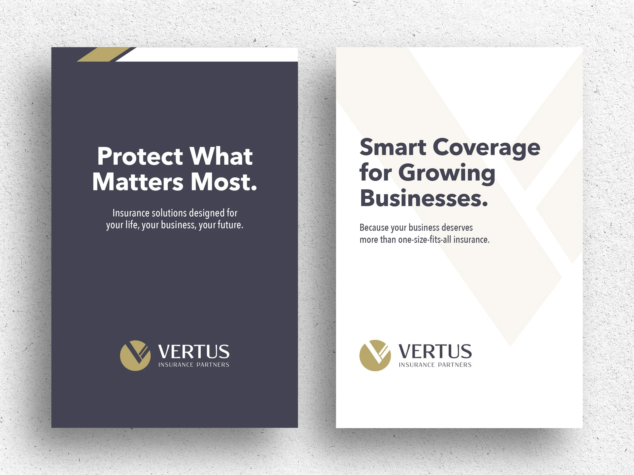
Poster concepts explored the Vertus visual language at a larger scale, using typography, contrast, and geometric graphic elements to create a stronger marketing presence.
Environmental Exploration
The visual language was also explored beyond traditional corporate and marketing communications and into potential environmental applications.
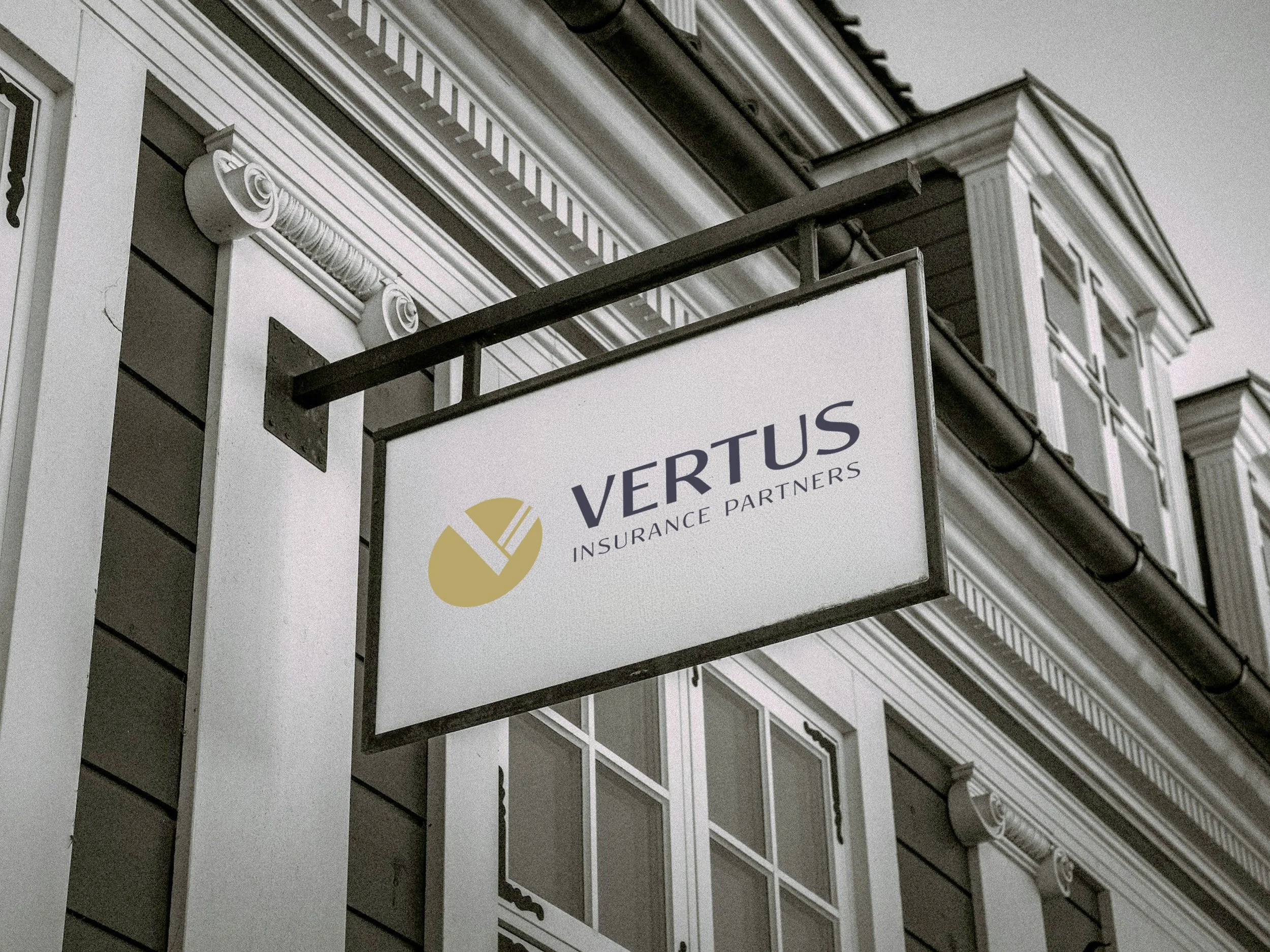
An environmental signage concept explored how the Vertus visual language could translate into a physical setting while maintaining the existing identity.
Large-Format Communication
The same visual language was explored at a larger public-facing scale, where the design needed to communicate quickly and remain recognizable within a busy environment.

A street-level ad adapted the Vertus visual language into high-visibility branding with concise messaging and imagery.