Watson Realty Corp.
Brand Evolution & Visual Identity System
My Role
Senior Graphic Designer
Deliverables
Creative Direction • Visual System Development • Marketing Communications • Production
Scale
50+ offices • Approximately 1,200 sales associates
The Challenge
Watson Realty Corp. had an established brand with significant recognition across a large organization. The challenge was to evolve the visual language so the brand could support an increasingly diverse range of marketing, recruiting, corporate, digital, and associate-facing communications without losing the recognition and equity built into the existing identity.
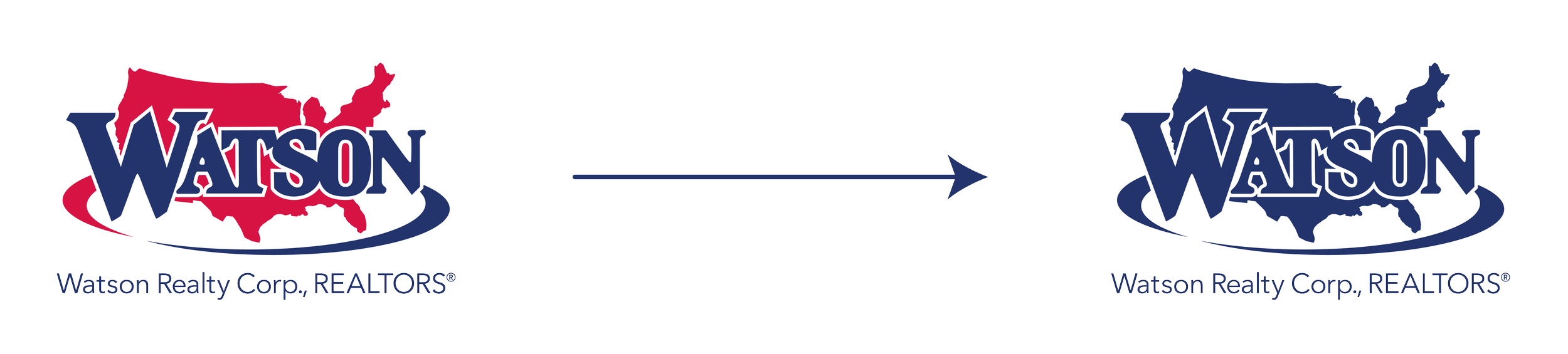
The identity was refined into a flexible single-color mark retaining the Watson brand’s recognizable structure.
My Role
I was one of two designers involved in the initiative and developed the creative direction selected for the brand refresh. My role extended beyond the initial visual direction: I developed the supporting visual system and translated the direction into practical applications designed to work consistently across the organization. This included creating visual elements, templates, marketing communications, recruiting materials, digital applications, signage, and associate-facing resources.
Evolving the Brand Without Losing Recognition
The objective wasn't to replace an established identity. It was to create additional visual structure around it. The system needed to introduce greater flexibility while remaining unmistakably Watson. Rather than creating a new identity, the approach was to build a visual language around the existing one — giving the brand more ways to communicate while preserving its established recognition.
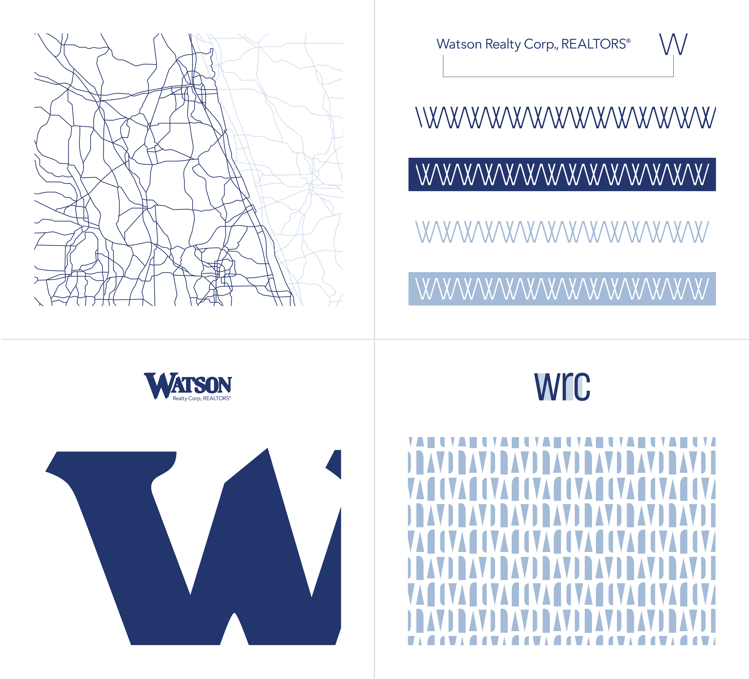
The visual system combined map-inspired linework, the Watson “W,” typography, patterns, and supporting graphic devices into a flexible set of recognizable brand cues.
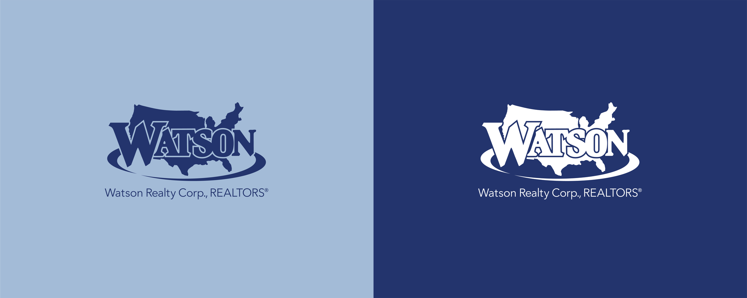
Expanding the palette through Segundo Blue.
The Visual System
The refreshed system expanded the existing identity through a set of supporting visual elements designed to work together across applications.
Segundo Blue
A distinctive supporting color that helped expand the visual palette and establish additional flexibility.
Custom Graphic Elements
Map-inspired linework, patterns, and other supporting devices that added visual structure and recognition across communications.
Watson Brand Badge
A recognizable branded element that could be incorporated into different applications.
Scalable Templates
Flexible layouts designed to support recurring communications and maintain consistency across users and formats. The system was created to make the identity easy to extend without losing its recognizable character.
From Identity to Application
A visual system only becomes valuable when it can function beyond a single piece of design. The Watson system was developed to support a broad range of applications, including:
Marketing communications
Recruiting materials
Digital applications
Signage
Associate-facing resources
Corporate Communications

Corporate business cards translated the refreshed identity into a restrained, repeatable format for everyday use.
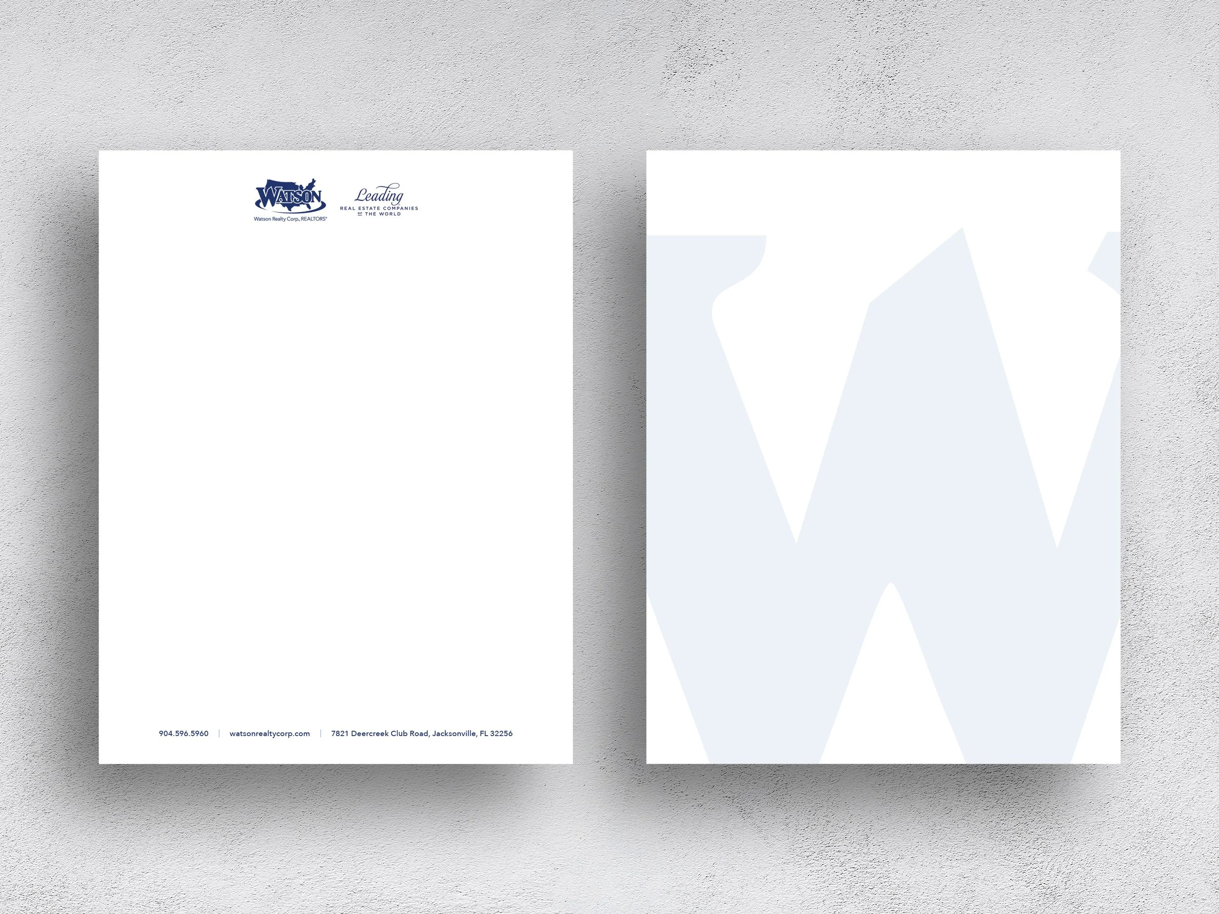
Letterhead brought the refreshed identity into a functional format while keeping the typography and graphic language restrained.
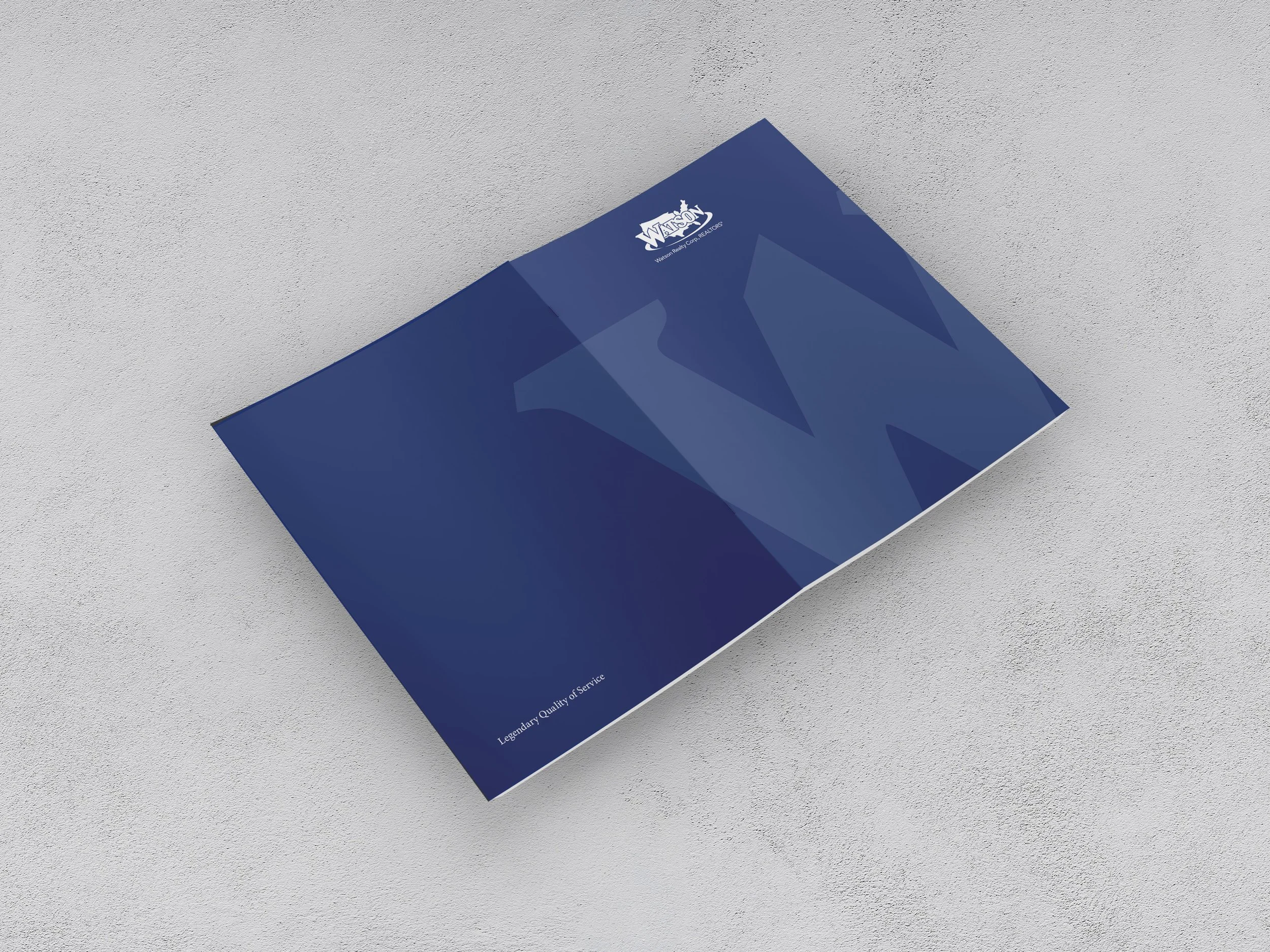
A presentation folder extended the Watson system through large-scale typography, color, and supporting graphic elements.
Recruiting Communications
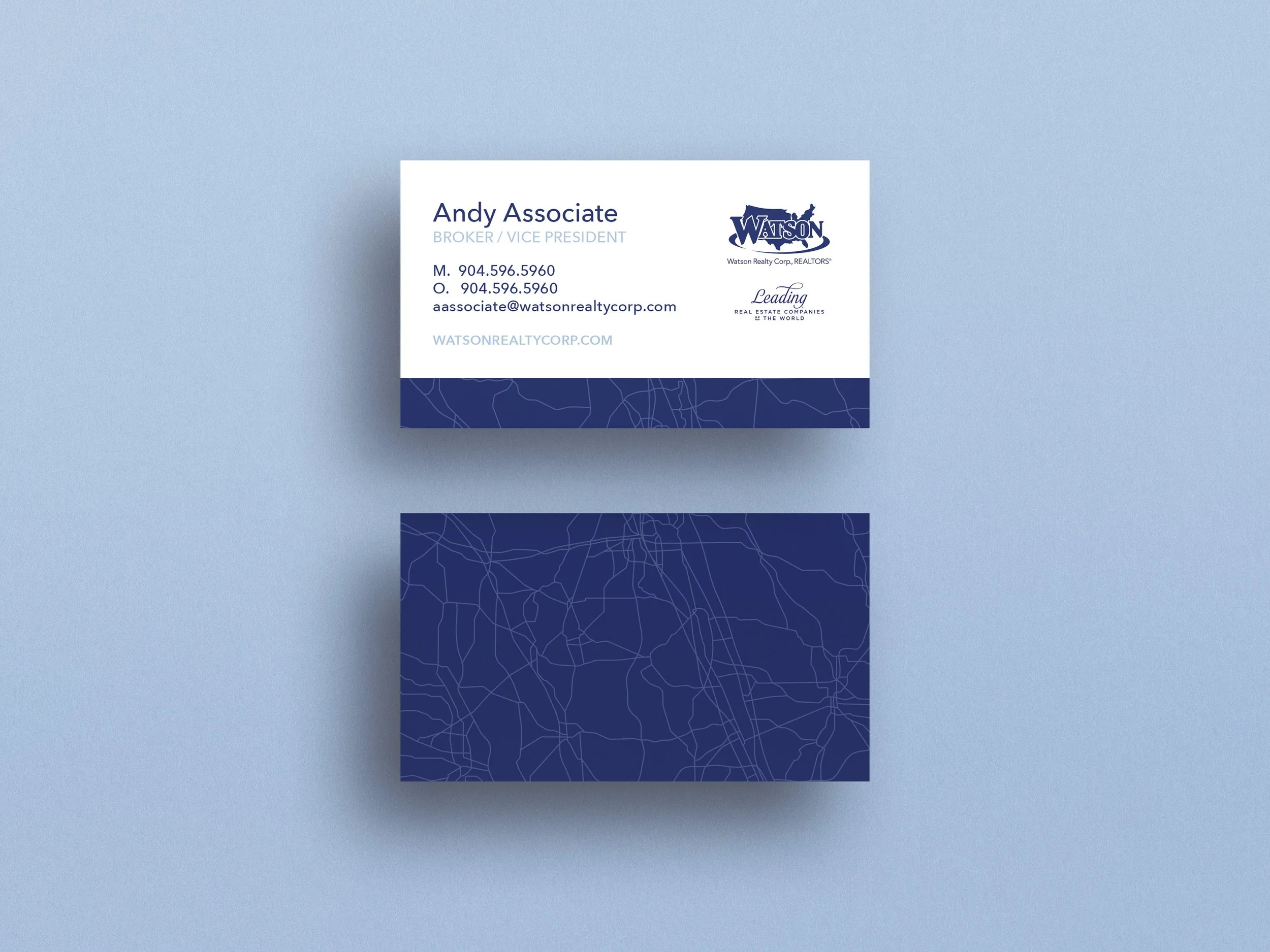
Recruiting materials adapted the visual system with map-inspired graphics suited to a different audience.
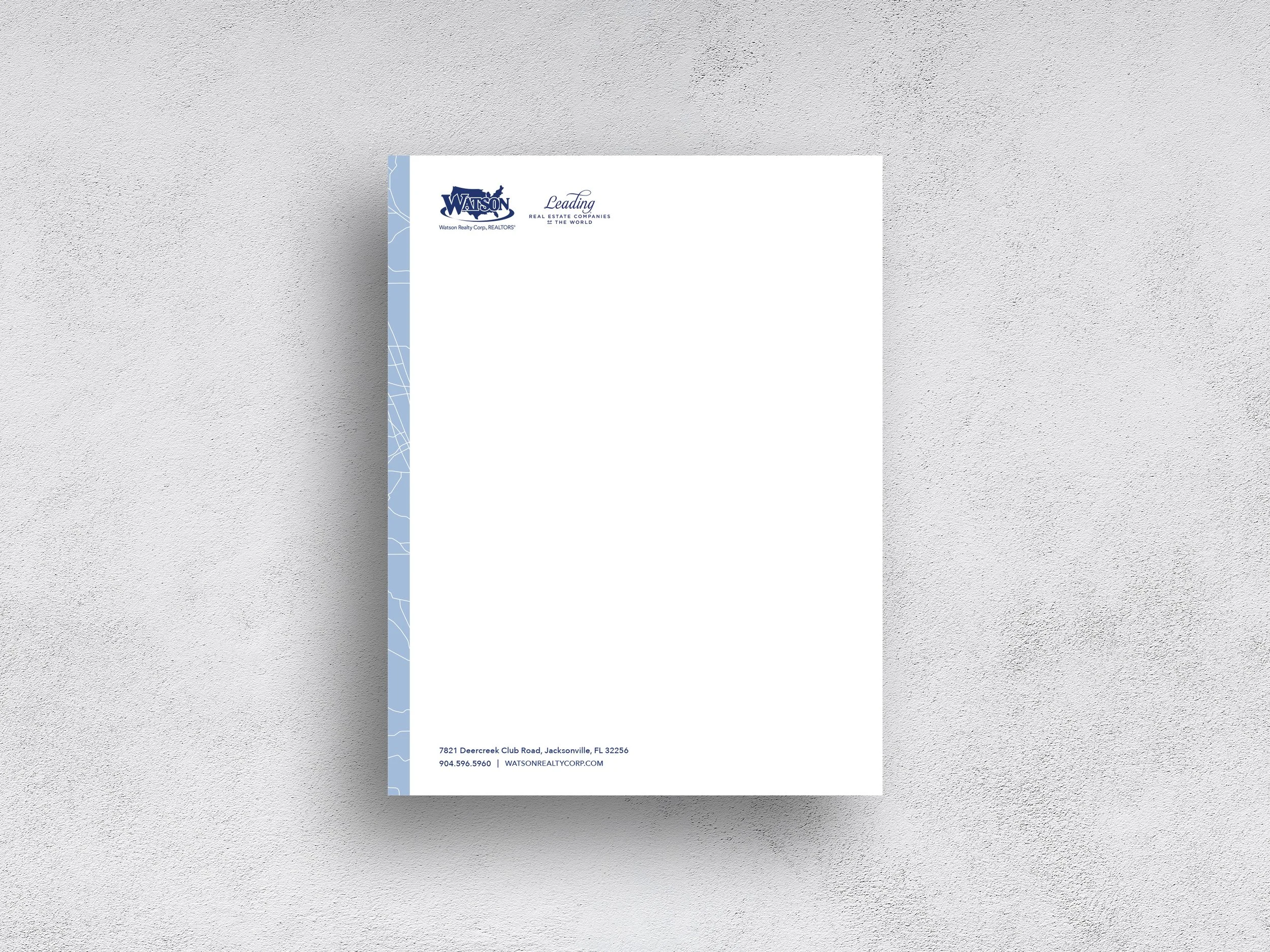
Recruiting stationery balanced the supporting graphic language with a clear, structured corporate format.
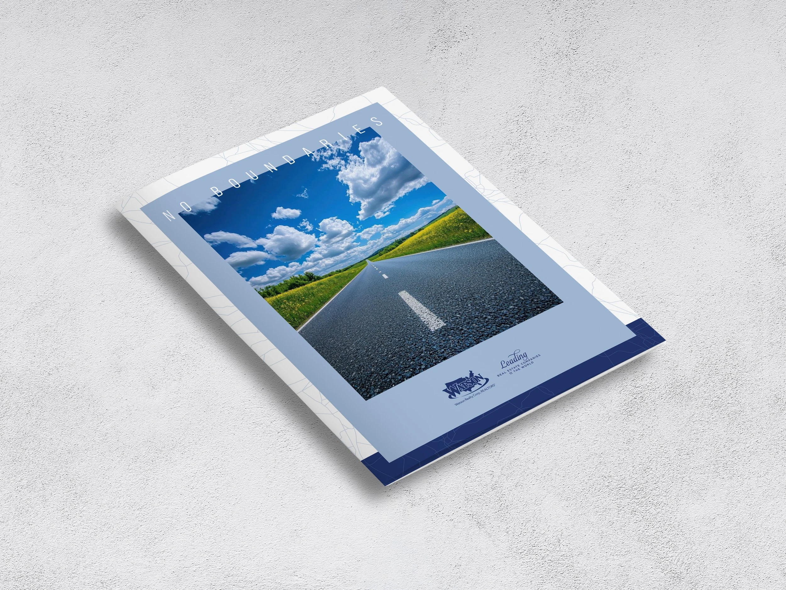
The recruiting book brought the visual system into a larger editorial format, balancing brand expression with recruitment-focused content.
Digital Applications
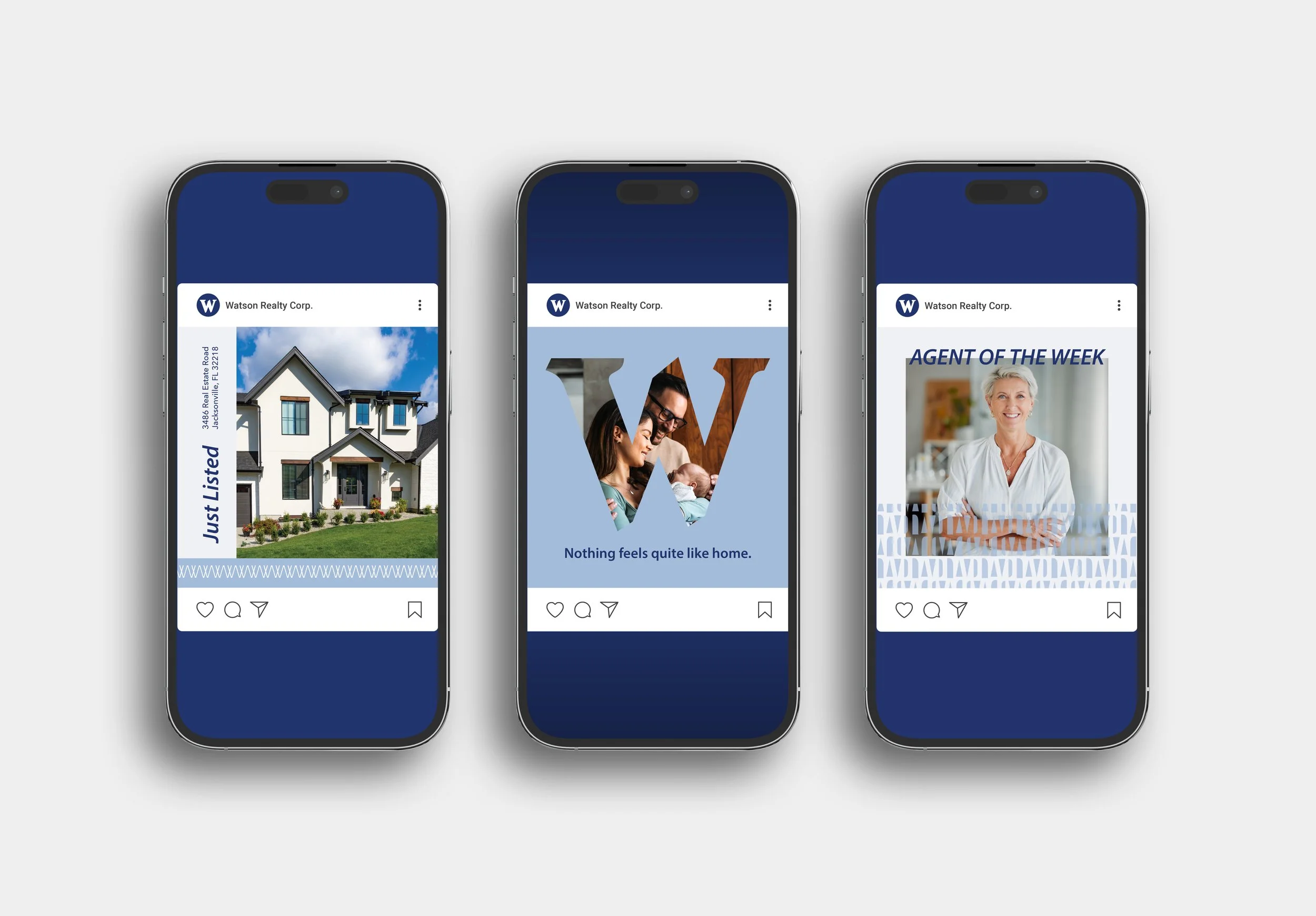
Social content demonstrated how the system could support recurring digital messages, from property marketing to associate features, without losing a recognizable Watson presence.
Marketing Communications
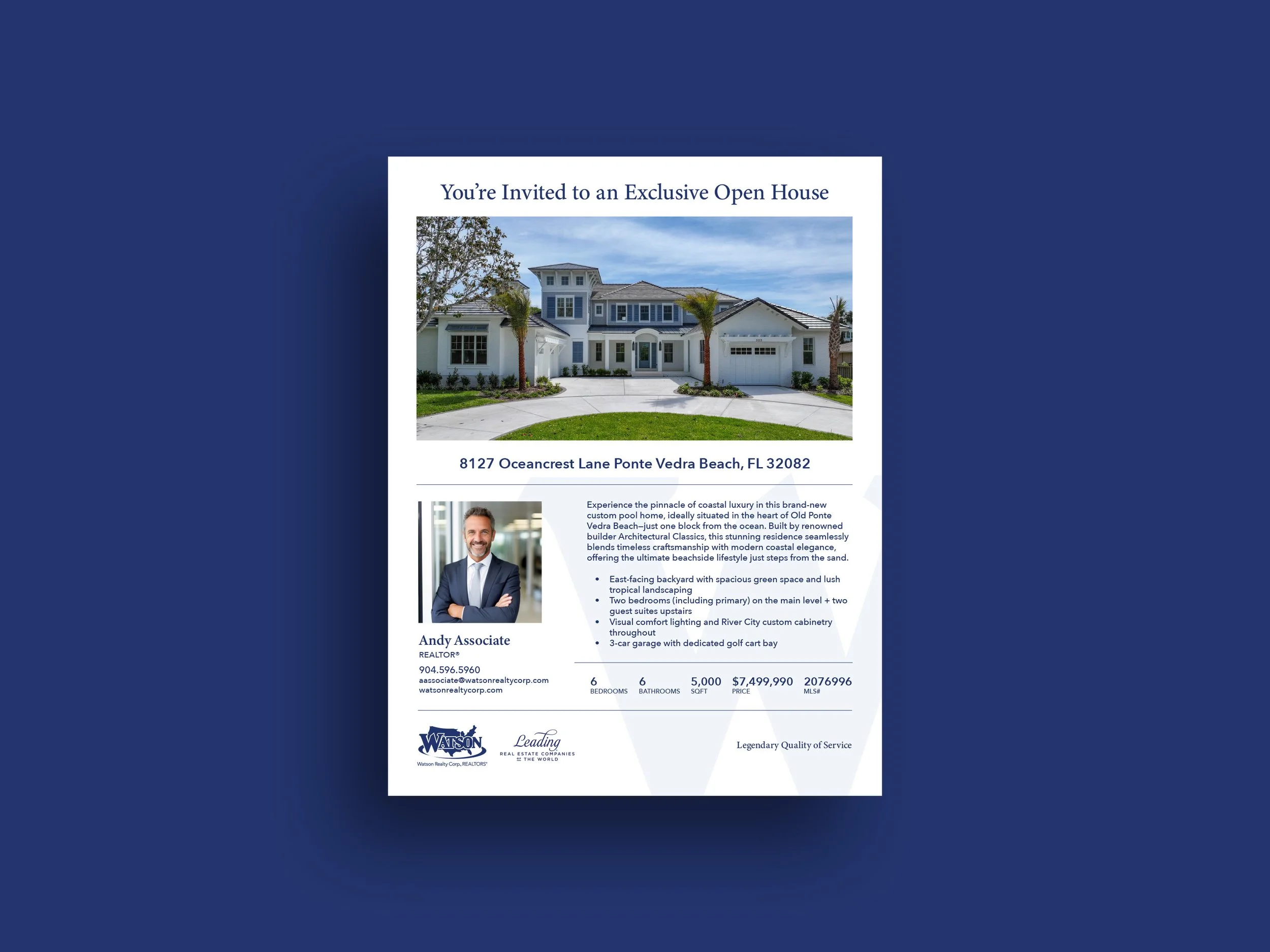
The open-house flyer adapted the broader brand system to a specific property while maintaining clear hierarchy for essential listing information.
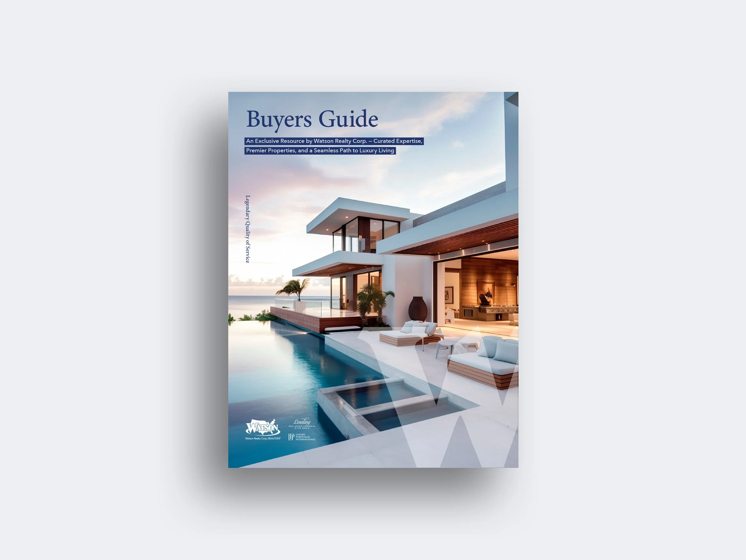
The buyer’s guide applied the visual system to a longer-form piece, balancing photography, typography, information hierarchy, and brand expression for a luxury residential audience.
Environmental & Field Applications
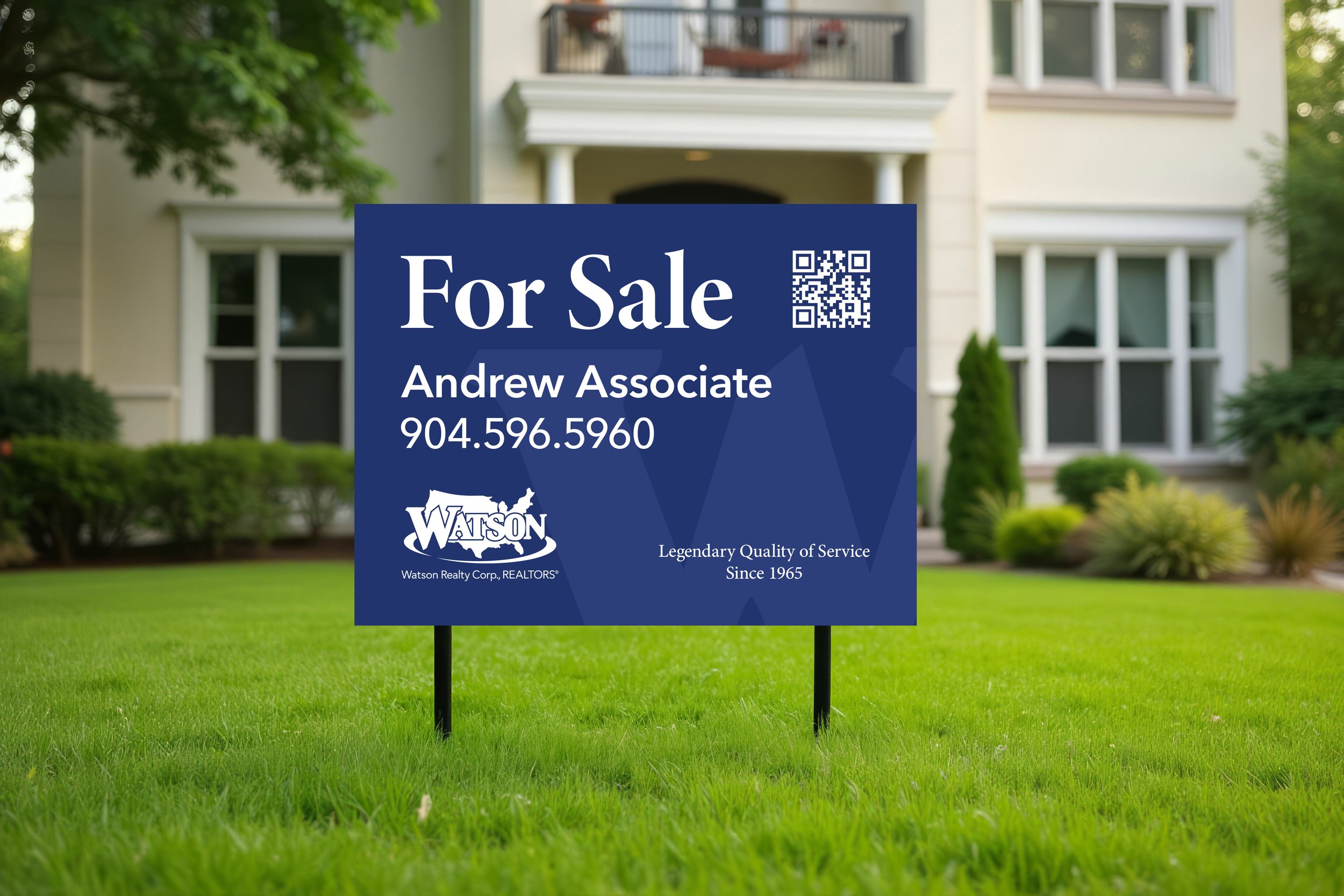
Property signage balanced strong brand recognition with the essential information needed for a fast, real-world read.
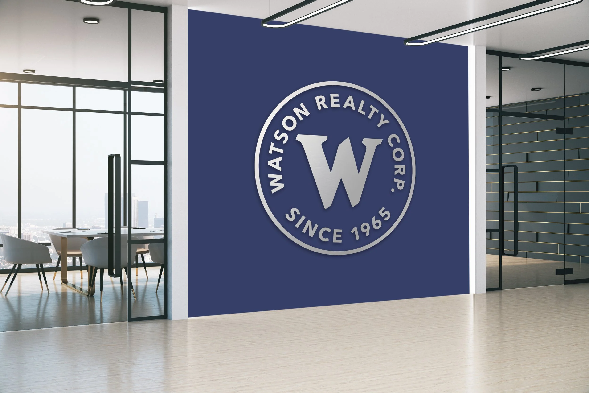
The Watson badge became an environmental brand element, translating the identity from communication materials into the physical workplace.
Designed for Organization at Scale
50+ offices
Approximately 1,200 sales associates
The system needed to function across a large organization with numerous users, applications, communication needs, and production environments. That meant the design couldn't depend on a single designer carefully controlling every individual execution. The visual language needed to be clear enough to repeat, flexible enough to adapt, and consistent enough to remain recognizable.
Building a System That Could Be Used
The value of the work wasn't limited to the initial creative direction. The supporting system had to work across recurring communications, different audiences, multiple formats, and real-world production environments. That required balancing creative development with practical considerations such as flexibility, consistency, scalability, and implementation. The goal wasn't simply to create better-looking materials; it was to create a system that could support the organization.
A Brand System Built to Scale
The Watson project demonstrates how an established identity can evolve without losing recognition—and how a visual system can extend beyond the core brand into the everyday communications an organization depends on. The result is a more flexible visual language capable of supporting marketing, recruiting, digital, signage, and associate-facing communications across a large organization.