
RPH Therapy & Consultation
Brand Identity & Visual System
My Role
Senior Graphic Designer
Deliverables
Brand Strategy • Identity Development • Typography • Color • Brand Applications • Print • Digital

The Challenge
RPH Therapy & Consultation needed a visual identity that clearly communicated its purpose while establishing a distinctive, professional presence. The challenge was to create more than a logo: a flexible identity capable of carrying the organization across print, digital, and client-facing communications.
Creating an Identity With Meaning
The identity was developed around the concepts of growth, connection, and well‑being, translating those ideas into a visual language that feels professional while remaining approachable. Rather than relying on a single graphic mark, the identity was created as a complementary set of elements that can work together across different applications.

The identity comes to life in a warm, human context, connecting the visual language to the experience the brand was intended to create.
From Concept to Identity
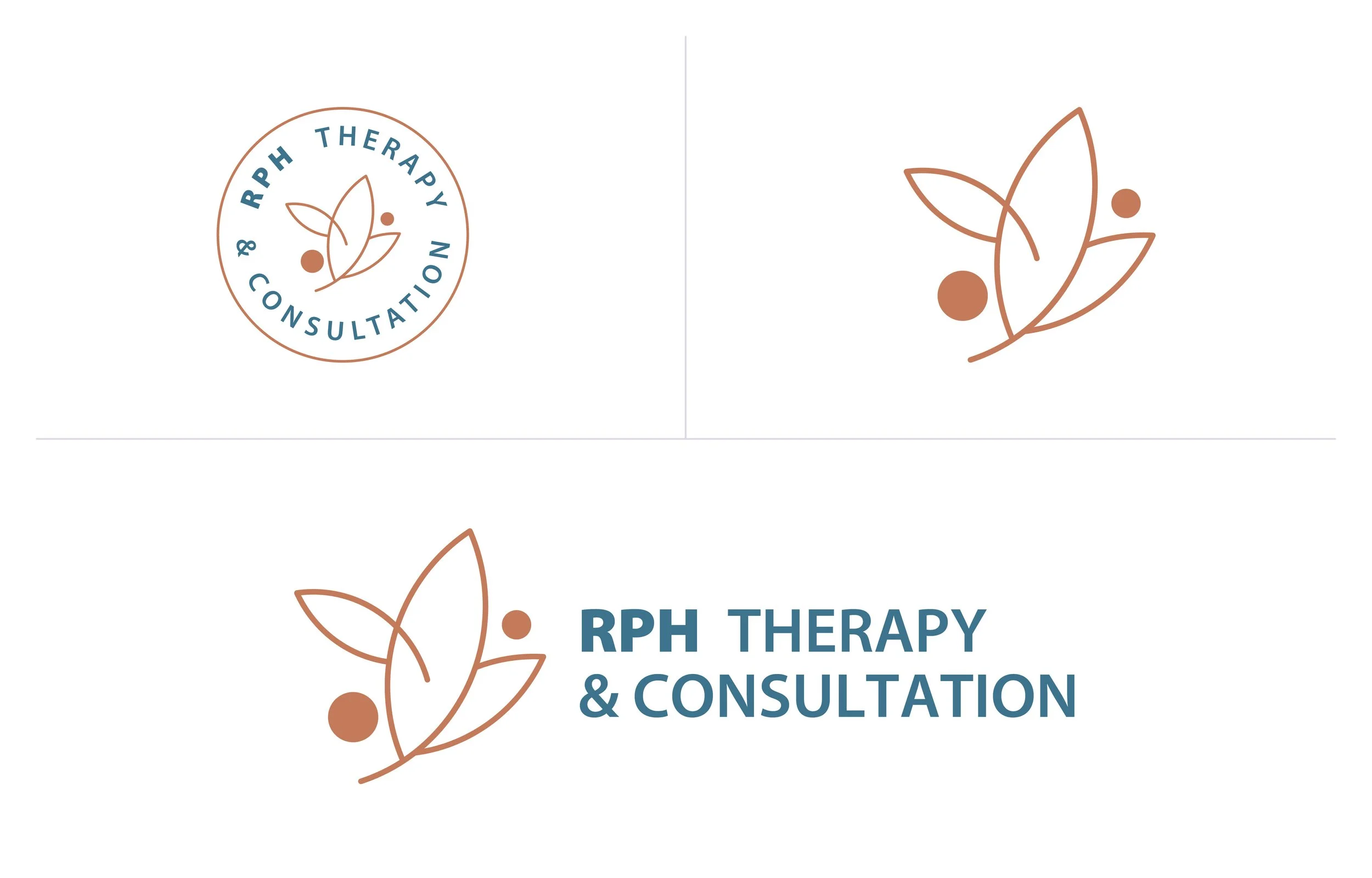
The core identity establishes the foundation for the visual system
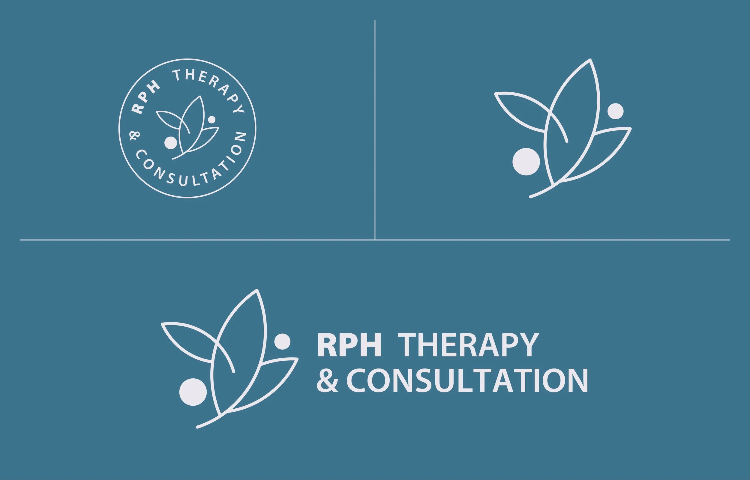
Logo
A distinctive mark designed to provide the organization with a recognizable visual signature.
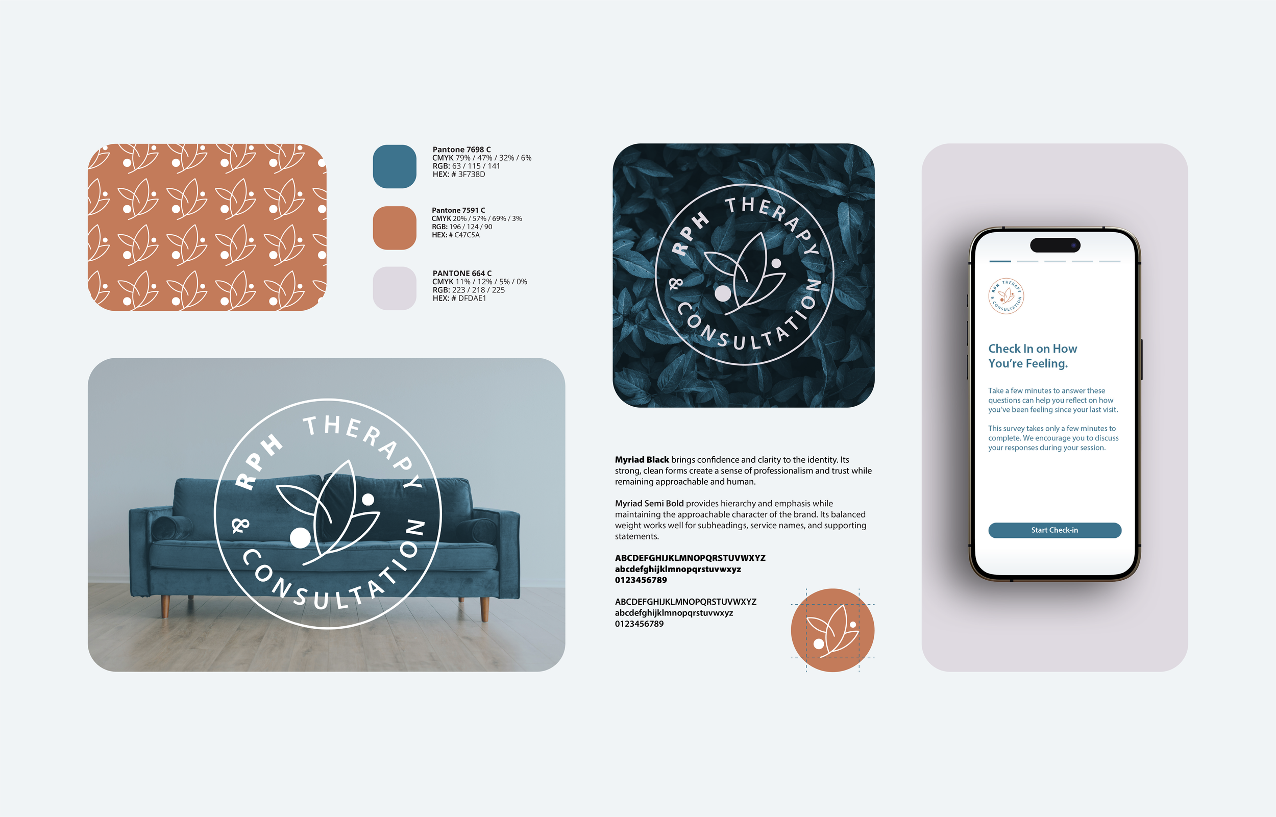
Typography
Typography establishes the tone of the identity while providing a consistent foundation for communication.
Color
The color palette creates a recognizable visual presence and provides flexibility across different applications.
Supporting Elements
Additional graphic elements extend the identity beyond the logo and create a cohesive visual language
Typography and color establish the tone and visual character of the identity beyond the logo itself.
Building the System
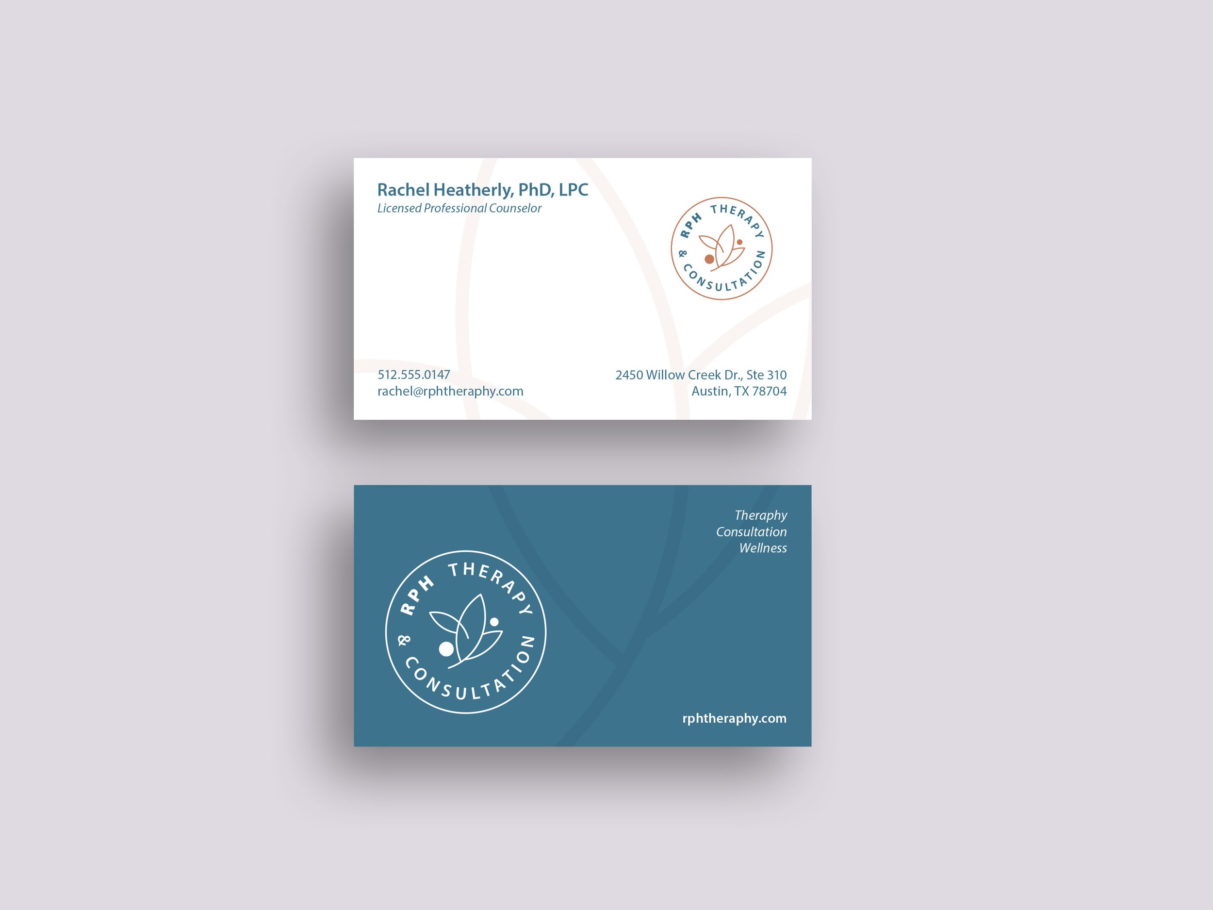
The strength of the identity comes from how its individual elements work together. The visual system was developed to provide consistency across:
Logo and identity applications
Typography
Color
Print collateral
Digital communication
Client-facing materials
Together, these elements give the organization a recognizable visual language that can adapt to different communication needs.
My Role
I developed the visual identity and supporting brand system, translating the initial creative direction into a cohesive set of visual elements and applications. My responsibilities included identity development, visual direction, typography, color, collateral, and implementation across print and digital communications.
From Identity to Experience
A successful identity must work beyond the initial presentation. For RPH, the system was designed to provide a clear foundation for communications while remaining flexible enough to accommodate different audiences, messages, and formats. The following application demonstrates how the identity functions in a direct, client‑facing context.
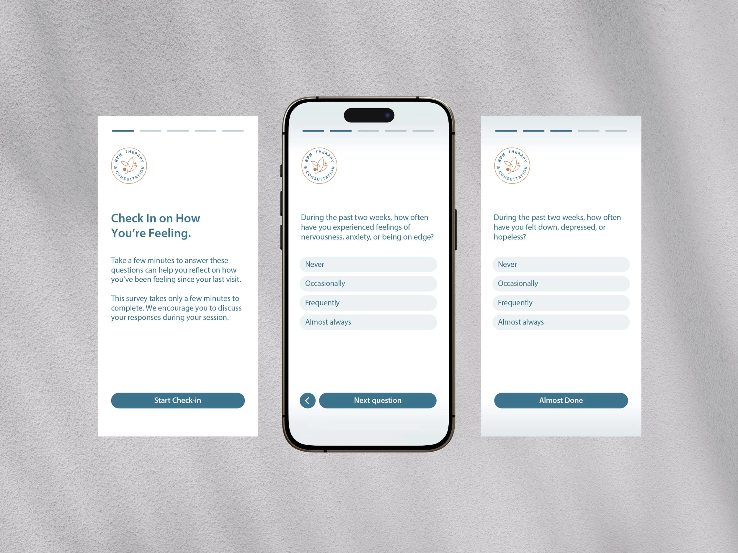
The identity translates into a clear, approachable digital experience designed for direct client interaction.
A Distinctive Foundation for the Brand
The resulting identity gives RPH Therapy & Consultation a cohesive visual presence that can extend across its communications, helping establish recognition and consistency as the organization communicates with its audiences.

The identity moves beyond communication materials and into the physical environment, giving the brand a tangible presence in the real world.
More Than a Logo
The project demonstrates the difference between creating an individual mark and developing an identity system. The logo establishes recognition; the supporting visual language gives the organization the tools to communicate consistently. That distinction is central to how I approach identity design.